Monday, June 3, 2013

Part 3: Screensavers for Security, OPSEC and Safety; Marketing to the Marines


Throwing this one mostly for fun, and to show how to target a different audience.

When I was deployed with the national guard to Iraq, I was in charge of the communications section for the base I was on.

We had some amazing problems that don't make sense in the real world. (seriously, how do you steal an entire building and move it across base without anyone noticing?)

I decided to try my screensaver solution on the unclassified network to address a few of the problems.

The real change was the audience. The base was almost completely US Marines. The Marines we met were very professional in some ways, and incredibly irreverent in other ways.

Overall, they were bored.

I had just listened to the Audible Audiobook audiobook version of Made to Stick: Why Some Ideas Survive and Others Die, and I was intregued by his ideas on how to make ideas viral. I combined those ideas and some I had read from other places to make a funny slideshow.  I started with demotivators.

If you have not heard of demotivational posters, they started with a company called despair.com.  They made fake motivational posters that were incredibly depressing.  The idea itself went viral and the interwebs are full of imitations.  There are whole sites where you could make your own and post it on the web. 
 
Only 3 of the slides were actuall pictures from Iraq.  The rest were from the internet.
 
I looked for ones that could be tied to our messages or reinforced the Marines' existing attitudes.  I will explain why later.


 This one was popular because it is the type of practical joke that the Marines enjoy:


Making fun of civilians:


Next a serious message slid in.  Too many accidents were being caused by not doing maintenance on equipment.  Preventative maintenance was a common theme.
 
 
Another silly one:


Followed by a serious one again.  We were having too many fires caused by really redneck wiring. 
The wiring was being done by the Marines themselves, and with only passing attention to safety. 
The social hack on this one is not obvious.  The whole base saw things like this every day. 
After 20 slides of funny things, they would kind of laugh halfhartedly through this slide.  After a while, just how redneck the whole thing was would start to sink in and they would laugh at the bad wiring.
The basic message:  You should make fun of people who do this kind of work
 
 
Daisy chaining extention cords or "creative" modifications of electrical appliances were another source of accidents.


Another one making fun of civilians:


Vehicles would tip over if the center of mass was too high or off to one side.  Load planning was essential.
 
 
or


Again, overloading the vehicle is a problem:


The picture is of a navy sailor.  The Marines had contempt for their weapon skills.


This one had the Marines rolling!


Again, after a series of funny slides, another to change attitudes.  This is a picture of a "unclassified" thumb drive in a laundry bag.  The laundry was done by a contracting company and there were huge problems throughout Iraq of servicemen forgetting their thumbdrives in their pockets when they sent their laundry away.
 
This is a bad way to share files... And bad OPSEC


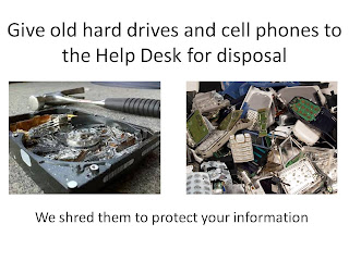
A couple of irreverent slides to make fun of the OPSEC program overall while reinforcing the "Shred All" policy


Not Iraq, but it reminds me of it:


And finally, it was against general order #1 to have pets.  This had a lot to do with diseases and injuries.  Not all things that are furry want to be cuddled.  How do you try to talk a Marine out of adopting a feral cat or dog?


Part 2. A Screen Saver as an OPSEC, Information Assurance and Security Tool?

In the last post, I talked about how to implement a screen saver to push information to your users.

Every time my users do something stupid like losing all of their data, corrupting their .pst file, or spilling PII (personally identifiable information) or OPSEC information, it costs my staff HOURS and a lot of pain in the butt.

(OPSEC is a handy Army acronym for Operational Security: protecting things you don't want your competitors to know)

That is only the beginning of what users will do.  Given a chance, they will:
  • Backup their entire hard drive to the network share
  • Each one of them keep a copy of every form, picture, map and regulation "where I can find it"
  • Try to maintain a 16 GB outlook .pst file and then complain about the slow computer
  • Use their personal email to send sensitive documents
  • Keep their corporate laptop after they quit
  • Keep every document forever on their laptop hard drive because they "don't trust the shared drive" and then freak out when the hard drive fails.
  • Never back up anything
I spend a LOT of time crafting the messages to convince them to do the "smart" things and keep them away from the "dumb" things.  The problem is that what is obvious to the IT department is not obvious to the users.

The whole point of my screensaver is to be a subliminal force to change what "obvious" is.

It is AMAZING how well it worked!

Even my first, ugly, redneck'd version had the Big Boss quoting it after the first week (and he barely touched a computer)  Maybe it was because it was new?

No, actually it turned out that with our screensaver set to kick on avert 10 min, users stuck on a long phone call ended up staring at my slides.  In an office where someone was on vacation, their slides just sat there pushing my message for hours on end to all their coworkers.

They could not help but absorb the message if I crafted it properly.


I took a bunch of the ideas from books I had read on consumer behavior:
Made to Stick: Why Some Ideas Survive and Others Die
Why We Buy: The Science of Shopping
Predictably Irrational: The Hidden Forces That Shape Our Decisions

After 10 years of experimentation, I figured out what works for me.  These are the rules I use:

  1. As few words as possible.  Brutally to the point
  2. BLUF:  Bottom Line Up Front.  The top line is the point and is the biggest print.  More detail follows in smaller print
  3. Slides need to be readable from 5 feet (ideally more) and in less than 30 seconds
  4. Pictures that transmit or reinforce the message only.  Scrap everything else that could distract.
  5. The slides need to be visually different.  This will catch the viewer's eye when they change.
  6. Slides with a similar theme need their own color palate.  The user will automatically connect similar looking slides later.
  7. Metaphor.  Whenever possible use a metaphor to explain your message.
  8. High visual ontrast.
  9. Don't sound like a nag.  Always tell the user what to do to make their lives easier.  Be helpful!
  10. Change them around so there is always something new to catch their eyes
  11. Throw in a few funny ones if you can get away with it. 
So, now time for some examples.  In the last post, I talked about the "loose lips sink ships" screen saver.  The problem is that my users already know not to tell secrets.  What they don't know is the list of things to avoid.

Here is an example of one in a series that talks about OPSEC, or things that we don't want getting leaked. 
There are two messages embedded in this one.  The first is that we don't talk about the employee's personal info.  The second is the plain english definition of the CIL. 

In our organization the Critical Information List (CIL) is the official list of information we need to safeguard.  The problem is that most users have never heard of the acronym.  Part of the messaging campaign is to push the definition of the CIL so that they will understand it when they hear it used around.

Note the high contrast, and the picture to reinforce the message. 

Here is another to prevent information leakage:

On the telecom side, we had the problem of the users taking their VOIP phones (and the #) with them when they got transferred.  This caused huge problems with the corporate phone directory.  After a year of this one running, we no longer have that problem:
 
The next one is a little more subtle in intent.  Sometimes users would be angry and not let us know.  Frequently we had a simple fix to their problem, but unless we could get them to call they would just sit there angry.  I took a hint from the book Nudge: Improving Decisions About Health, Wealth, and Happiness.  (It should be re-titled "How to Steer People to do the Right Thing Without Looking Like a Jerk")

I made a slide that simply had our contact info.   It acted to remind the user to call us. 

Users would think " Oh yeah! My email is still messed up" and call us. 

The number of calls and emails increased, and we were able to solve more of the problems before the users got REALLY mad.  Customer satisfaction increased.
One interesting side effect.  For years, users would call their "friend" in the IT department instead of calling the help desk.  They never got as good of service, and my techs were distracted.

By using this screen saver slide and a "speed bump" (talk about that in another post) we got the users to mostly call the help desk.  The users got better service and I was able to get a little more efficiency out of my techs.


Another nudge pre-empted many of the phone calls after we switched to the new phone system:

We were spending too much time transferring data for users when they traded out computers.  It was costing us a lot of manpower. 

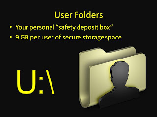
It turns out the reason that they were saving it all on their hard drive was because they wanted their important stuff "safe" and keeping it themselves seemed like a good idea.  The problem is that the laptop hard drives failed more than the RAID on the server.  I got sick of the users asking for data recovery services, so:
The "Safety Deposit Box" metaphor really worked to change the attitudes.  Users that followed the advice lost less data. 

In information assurance or cyber security terms, I had just increased the availability and integrity of the information by convincing the user to put the important info in a safer place.


Too many copies of the same official memos etc on the server?  Make it easier to find, and make it seem like it is on their own hard drive:


My next slide show project:
Our organization is now going to start implementing Lean Six Sigma in a big way, but most of the users have never heard of it.  In the Lean training, they talk about the biggest problem is to get initial acceptance when nobody has heard of the program. 

My next set of slides will have the basics of what Lean is, and the basic terms used in Lean.  In simple language.  Hopefully, the users will be so used to the terms that it will be easier for them to adopt when they get their first Lean class.

Until next hack.

Part 1 .A Screensaver? The Best Enterprise Computer Security and OPSEC Program

The best enterprise security program I ever implemented was a free screen saver by Microsoft.  I implemented it network wide in a day, and it has had huge positive impacts for our organization.

By boss has a quote: "By the time the CEO is absolutely sick of repeating his message, the workers on the factory floor are just starting to hear what he is trying to say."

From my (Director of I.T.) standpoint, that is even saying it too nicely.  In reality, nobody wants to hear what IT or the Help Desk has to say even though listening to us will do more to make the users' experience better than anything else.

In fact, most emails from I.T. go straight to the bit bucket (trash can.)  This in part is because we are seen as the "Network Nazis" who are constantly trying to prevent the users from completing their work.

We spend a lot of time trying to make things easier on the users by making things easier and less confusing.  The problem is that the users come up with crazy ways to do everything you can imagine based upon what they think is obvious and intuitive. 

My basic problem is that I needed to get certain messages across to the users in a way that would actually get through.  Emails were not working, nasty emails were REALLY not working. 

How do you change what is intuitive to the user?

I got the idea while my National Guard unit was mobilized in Iraq.  One of the bases had a screen saver of the "loose lips sink ships" variety.  The admins had a sense of humor, so it had a lot of LOTR and other geek references.  One example was a picture of the Eye of Sauron  with the tagline "the all-seeing eye of the network"

I realized that the idea of using a screen saver as a subliminal training aid made a lot of sense, but that the problem was in the core of the message.  The "don't tell secrets" was not specific enough.  It never told us WHAT not to tell.

Skipping ahead in the story, I am on my third version of the screen saver.  The technology has not changed, but the message and the delivery has changed a lot.

How to implement on windows:
  1. Set up a network share to put your pictures in
  2. Enable the server side setting "always available offline." This makes sure that the screensaver will keep going when a laptop is off the network
  3. Create your slides in powerpoint and export them as .jpg  to the network share
  4. Change your screensaver to the windows 7/8 "Photos Screensaver"
  5. Edit the screensaver settings to point at your central photo share:

    6. Export the registry folder for. HKEY_CURRENT_USER\Software\Microsoft\Windows Photo Viewer\Slideshow\Screensaver.  This is important because the screen saver location is encrypted.
    7.  Use group Policy to push these settings.  I have also used a batch file logon script when I was in a hurry.

Now all of your users who use the  photos screen saver will get your slides.  You can test variations of the slides until you are happy with them.

    8.  Force the new screen saver on your users using the standard group policy interface.

Next, the hard part:  crafting the message!

Thursday, May 30, 2013

Book suggestion: Eastern Standard Tribe. Great story AND lots of ideas for improving user experiences


One of my favorite authors, Cory Doctorow, has a very different and interesting book about an Interface Designer who makes his living figuring out how to make the world easier to use.

One of the main characters inventions is a mesh network music sharing application that shares music from car to car.  This means it works better and gives you more options when in traffic...

So, what happens when an elite interface designer gets committed to a mental institution?  He finds all the loopholes in the security of course!

I liked the story itself, but it also gave me a large number of ideas on how to improve the experience of my users.


The book is free online
http://www.craphound.com/est/Cory_Doctorow_-_Eastern_Standard_Tribe.html

or, if you want to pay to have it on paper:
Eastern Standard Tribe

Once Seen, Cannot be Unseen. How I Became a Process Improvement Nut

Some things once seen, cannot be unseen. 

Years ago, someone pointed out how to identify a well done ceramic tiling job.  Now when I enter a room, my eyes go instantly to the one tile that is not lined up properly.  That is annoying.

The webcomic XKCD made a joke about this effect http://xkcd.com/1015/ (don't look up the word unless you want to be haunted by badly designed signs forever)

My lifelong hobby (obsession) of process improvement came from one of these "cannot be unseen" topics.

 As part of our family ritual on Sunday afternoons, my mother would read aloud from comedy books.  Most often it would be the stories by Patrick McManus and describe the bizarre exploits of his character Rancid Crabtree.  My mom would try to keep reading even as the laughter made her hitch to catch her breath and tears ran down her face.  My mother is a large lady who looks like a Swedish incarnation of Mrs. Santa Claus.  Watching her shaking  and crying with laughter made the story even funnier.  As a barely-teenager I always thought of it as a "mirthquake," These days were some of my fondest memories growing up.

One of the books she read, and laughed to, was Cheaper By the Dozen.  (Please ignore any of the movies of the same title.  They are unrelated)  This incredibly funny story is about the long suffering and large family of Frank Gilbreth, one of the first process efficiency experts.  The father is loud and friendly in a way that embarrasses his kids but is so absorbed in the efficiency concepts that he does everthing he can to embed it into his family's entire life.  To get all the 12 kids through baths on Sunday night, he developed a scientific way to soap and rinse your body that defined the exact path the soap would take over your body.  Every tiny aspect of their lives is analyzed and made efficient.  The reactions of his family are hilarious.

Buried in the story though were little hints of the "motion study" process that he invented.  It defined a way to think about how to make any process more efficient, cost less, work better and be less annoying.

I looked up his process in the library and learned about how to describe the process in logical, measurable steps using "therbligs." These were Gilbreth's functional units of process and motion.

It became a constant hobby of mine to look at any process or series of actions and figure out how to make it work better...  In this way I thought about bus routes, checkout lines, building sand castles... everything.

In college, my Biotechnology class discussed producing a chemical in a bacteria by genetically engineering in all the enzymes necessary to convert the precursor step by step.  To get the greatest efficiencies, we used math to figure out the slowest parts of the chemical process.  Then, we would work to fix the "rate controlling step."  This fix would give the highest payoff.

It occurred to me that this idea of finding the slowest part of a process and speeding it up to get the biggest ROI worked outside the lab.

Then I started noticing the choke points in all the processes I saw.  I started really annoying people with helpful comments like "you know, the slowest part of the checkout process is the person swiping their card.  You could double the customer throughput if you..."

Years later, I took an Army correspondence course on "Human Factors Engineering" that talked about how to design things to actually interact well with people.  The book contained endless tables on how big things needed to be for a person to use it, the 7 colors that can be seen under low light conditions, the amount of resistance a button should give so that you can feel it with gloves on...

 I found out later that my father was one of the thousands of soldiers that the Army measured  in hundreds of dimensions (arm span, leg length, head size, distance between the eyes, thumb length, etc) to make those endless tables.

After that course, I started noticing badly designed hallways, access panels, kitchens, etc.

The next piece of the puzzle hit about 15 years ago when my programming instructor, Mr. Lacoq, gave me an essay he had written.  This essay started by discussing a ratchet system like the one on a guillotine.  The handle can twist either way, but when it turns one way the pawl slides smoothly over the notches and the handle spins freely.  When the handle spins the other way, the pawl catches on the notches and the blade is lifted up by one inch.  (see http://en.wikipedia.org/wiki/Ratchet_(device)  for a good demo)  If the handle spins back and forth randomly, the guillotine blade will slowly rise.

His point was that social cultures can have this same ratchet.  His example was in the military.  If, on a very small level, the officers with a slightly better uniform got promoted early,  that produces a similar ratcheting mechanism.  Even though the incremental changes may be tiny, over a period of years the organization will shift steadily.  In extreme cases, such a ratcheting system can drive an organization into behaviours that it would never consciously condoned.

His example was the difference wartime vs. peacetime ratchets for the officers.  During peacetime, the ratcheting system encourages crisp uniforms and not rocking the boat.  During wartime combat effectiveness was more important.

I learned a couple of things from that essay:
1.  The incredible but subtle power of small ratchets
2.  You can make huge long term improvements by changing the direction of a ratchet
3.  The attitudes of the people in the system are the biggest part of the system that needs to be addressed.  If you build a perfectly efficient system, but the social ratchet is drifting a different direction, your improvements will be discarded.

In short, changing attitudes is the most important part of the process redesign in the long term.  You need a advertising campaign with a carefully crafted message.

Since then, I have spent my time trying to craft the messages as part of the initial design of the improved process.  This blog is where I will tell of the things that have worked.