Every time my users do something stupid like losing all of their data, corrupting their .pst file, or spilling PII (personally identifiable information) or OPSEC information, it costs my staff HOURS and a lot of pain in the butt.
(OPSEC is a handy Army acronym for Operational Security: protecting things you don't want your competitors to know)
That is only the beginning of what users will do. Given a chance, they will:
- Backup their entire hard drive to the network share
- Each one of them keep a copy of every form, picture, map and regulation "where I can find it"
- Try to maintain a 16 GB outlook .pst file and then complain about the slow computer
- Use their personal email to send sensitive documents
- Keep their corporate laptop after they quit
- Keep every document forever on their laptop hard drive because they "don't trust the shared drive" and then freak out when the hard drive fails.
- Never back up anything
The whole point of my screensaver is to be a subliminal force to change what "obvious" is.
It is AMAZING how well it worked!
Even my first, ugly, redneck'd version had the Big Boss quoting it after the first week (and he barely touched a computer) Maybe it was because it was new?
No, actually it turned out that with our screensaver set to kick on avert 10 min, users stuck on a long phone call ended up staring at my slides. In an office where someone was on vacation, their slides just sat there pushing my message for hours on end to all their coworkers.
They could not help but absorb the message if I crafted it properly.
I took a bunch of the ideas from books I had read on consumer behavior:
Made to Stick: Why Some Ideas Survive and Others Die
Why We Buy: The Science of Shopping
Predictably Irrational: The Hidden Forces That Shape Our Decisions
After 10 years of experimentation, I figured out what works for me. These are the rules I use:
- As few words as possible. Brutally to the point
- BLUF: Bottom Line Up Front. The top line is the point and is the biggest print. More detail follows in smaller print
- Slides need to be readable from 5 feet (ideally more) and in less than 30 seconds
- Pictures that transmit or reinforce the message only. Scrap everything else that could distract.
- The slides need to be visually different. This will catch the viewer's eye when they change.
- Slides with a similar theme need their own color palate. The user will automatically connect similar looking slides later.
- Metaphor. Whenever possible use a metaphor to explain your message.
- High visual ontrast.
- Don't sound like a nag. Always tell the user what to do to make their lives easier. Be helpful!
- Change them around so there is always something new to catch their eyes
- Throw in a few funny ones if you can get away with it.
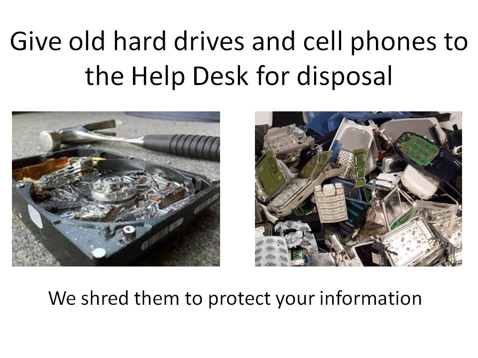
Here is an example of one in a series that talks about OPSEC, or things that we don't want getting leaked.

In our organization the Critical Information List (CIL) is the official list of information we need to safeguard. The problem is that most users have never heard of the acronym. Part of the messaging campaign is to push the definition of the CIL so that they will understand it when they hear it used around.
Note the high contrast, and the picture to reinforce the message.
Here is another to prevent information leakage:
On the telecom side, we had the problem of the users taking their VOIP phones (and the #) with them when they got transferred. This caused huge problems with the corporate phone directory. After a year of this one running, we no longer have that problem:

I made a slide that simply had our contact info. It acted to remind the user to call us.
Users would think " Oh yeah! My email is still messed up" and call us.
The number of calls and emails increased, and we were able to solve more of the problems before the users got REALLY mad. Customer satisfaction increased.

By using this screen saver slide and a "speed bump" (talk about that in another post) we got the users to mostly call the help desk. The users got better service and I was able to get a little more efficiency out of my techs.
Another nudge pre-empted many of the phone calls after we switched to the new phone system:

It turns out the reason that they were saving it all on their hard drive was because they wanted their important stuff "safe" and keeping it themselves seemed like a good idea. The problem is that the laptop hard drives failed more than the RAID on the server. I got sick of the users asking for data recovery services, so:
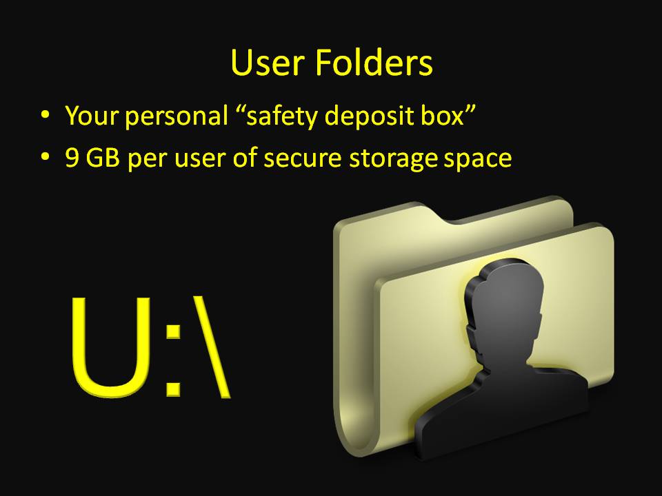
In information assurance or cyber security terms, I had just increased the availability and integrity of the information by convincing the user to put the important info in a safer place.
Too many copies of the same official memos etc on the server? Make it easier to find, and make it seem like it is on their own hard drive:

My next slide show project:
Our organization is now going to start implementing Lean Six Sigma in a big way, but most of the users have never heard of it. In the Lean training, they talk about the biggest problem is to get initial acceptance when nobody has heard of the program.
My next set of slides will have the basics of what Lean is, and the basic terms used in Lean. In simple language. Hopefully, the users will be so used to the terms that it will be easier for them to adopt when they get their first Lean class.
Until next hack.
No comments:
Post a Comment